This page shows what each setting on the Generation tab changes in your code, so you can choose values with the result in front of you.
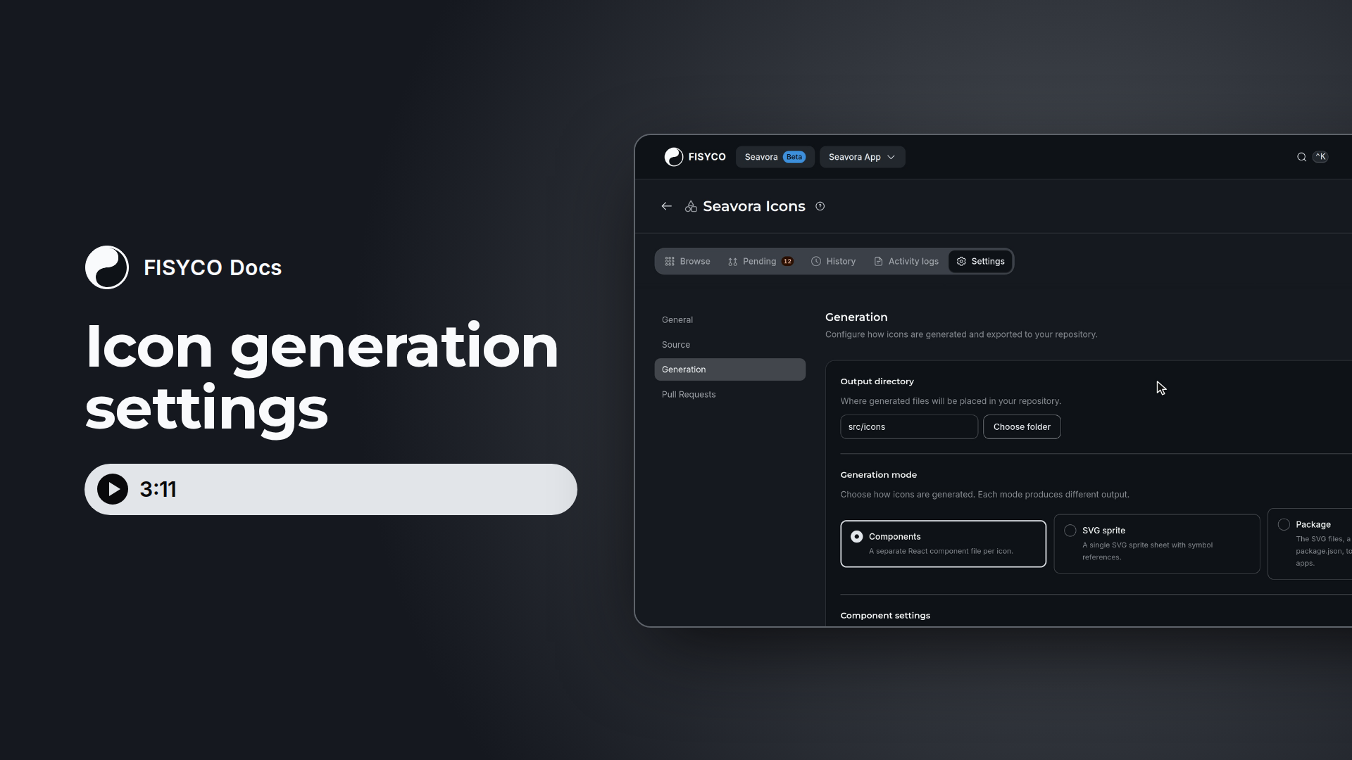
Where the settings live and when they apply
Open the icons library, then Settings, then Generation. A save bar appears when you change something, and Save changes stores it. The same form is the Generation step when you create a library.
Files are built when you export or create a pull request, not at sync. Saving only stores the settings. The library then shows Changes detected: click Sync now, and the new files reach your repository with the next pull request. Each time, FISYCO regenerates all active icons of the library, not only the ones that changed.
The icons used in the examples
The two icons below are illustrative samples, shaped like real Figma exports. Each output block on this page is what the generator produced for them. The output directory is src/icons unless an example says otherwise.
Arrow Right, on the Figma page Filled, in the section Arrows:
<svg
  width="24"
  height="24"
  viewBox="0 0 24 24"
  fill="none"
  xmlns="http://www.w3.org/2000/svg"
>
  <path
    d="M4 11H16.17L10.59 5.41L12 4L20 12L12 20L10.59 18.59L16.17 13H4V11Z"
    fill="#000000"
  />
</svg>Search, on the page Outline, in the section General UI:
<svg
  width="24"
  height="24"
  viewBox="0 0 24 24"
  fill="none"
  xmlns="http://www.w3.org/2000/svg"
>
  <circle cx="11" cy="11" r="7" stroke="#25314C" stroke-width="1.5" />
  <path
    d="M20 20L16 16"
    stroke="#25314C"
    stroke-width="1.5"
    stroke-linecap="round"
  />
</svg>
With every component setting at its default, they generate these two files. The examples are formatted for reading, and the generator writes each component's JSX on one line.
src/icons/arrow-right.tsx
import * as React from "react";
import type { SVGProps } from "react";
const ArrowRight = (props: SVGProps<SVGSVGElement>) => (
  <svg
    xmlns="http://www.w3.org/2000/svg"
    width="1em"
    height="1em"
    fill="none"
    viewBox="0 0 24 24"
    {...props}
  >
    <path
      fill="#000"
      d="M4 11h12.17l-5.58-5.59L12 4l8 8-8 8-1.41-1.41L16.17 13H4z"
    />
  </svg>
);
export { ArrowRight };
src/icons/search.tsx
import * as React from "react";
import type { SVGProps } from "react";
const Search = (props: SVGProps<SVGSVGElement>) => (
  <svg
    xmlns="http://www.w3.org/2000/svg"
    width="1em"
    height="1em"
    fill="none"
    viewBox="0 0 24 24"
    {...props}
  >
    <circle cx={11} cy={11} r={7} stroke="#25314c" strokeWidth={1.5} />
    <path
      stroke="#25314c"
      strokeLinecap="round"
      strokeWidth={1.5}
      d="m20 20-4-4"
    />
  </svg>
);
export { Search };
Components pass through svgo, which explains the differences from the input. #000000 becomes #000, #25314C becomes #25314c, and path data gets shorter. xmlns and viewBox are kept.
Output directory
Output directory is the base path of every generated file. Type a path or click Choose folder. If the folder doesn't exist, the first generated commit creates it. The output directory is a folder in the repository connected to your project.
The field is required and has no default. It allows up to 256 characters: Latin letters, digits, _, ., /, - and @, with no ...
Generation mode
Generation mode decides what lands in the output directory. The default is Components, and the form shows only the settings of the chosen mode.
Components are generated for React. For another framework, use the sprite or the package.
How a Figma name becomes a file, a component and a symbol id
At sync, FISYCO normalises the Figma name. It lower-cases the name and turns whitespace into -. Characters such as /, _, = and , are removed. A name set with Apply rename is used instead of the normalised one. For a component or a symbol id, a name with no Latin letters or digits falls back to the Figma node id.
This table comes from a real run with the pattern {section}/{name}, the section Arrows and the symbol id prefix icon.
A slash in a Figma name never makes a folder. Folders come from Figma pages and sections, through {page} and {section}.
When several icons end up with the same file path, later ones get a number. With the default pattern, three icons named Arrow Right become arrow-right.tsx, arrow-right-2.tsx and arrow-right-3.tsx, and their components are ArrowRight, ArrowRight2 and ArrowRight3. With {section}/{name}, icons in different sections keep the same file name and component name, each in its own folder. Sprite ids and package files are numbered by name alone, whatever the pattern.
Components
These settings appear when the mode is Components. Each example changes only the settings it names and leaves the rest at the defaults shown above.
Output pattern
Output pattern builds the path of each file inside the output directory. It has three placeholders: {page} for the Figma page, {section} for the frame on it, and {name} for the icon. The default is {name}.
{name} is required. Without it the form marks the field invalid and won't save, because every icon needs its own file.
{page} and {section} are kebab-cased, so the section General UI becomes the folder general-ui. An icon placed directly on the page has no section, and that empty segment is dropped.
The table shows generated paths for Arrow Right and for a third illustrative icon, Plate, which sits directly on the page Filled.
FISYCO adds .tsx or .jsx only if the path doesn't already end in an extension. The pattern {name}.icon therefore gives src/icons/arrow-right.icon, with no .tsx.
Only these three placeholders exist. Any other is kept as text with its braces turned into underscores: {category}/{name} gives src/icons/_category_/arrow-right.tsx.
TypeScript
TypeScript is on by default. It generates .tsx files with typed props. Turned off, it generates untyped .jsx files.
src/icons/arrow-right.jsx
import * as React from "react";
const ArrowRight = (props) => (
  <svg
    xmlns="http://www.w3.org/2000/svg"
    width="1em"
    height="1em"
    fill="none"
    viewBox="0 0 24 24"
    {...props}
  >
    <path
      fill="#000"
      d="M4 11h12.17l-5.58-5.59L12 4l8 8-8 8-1.41-1.41L16.17 13H4z"
    />
  </svg>
);
export { ArrowRight };
Export type
Export type is Named export by default, or Default export. Only the last line changes.
src/icons/arrow-right.tsx with Default export:
import * as React from "react";
import type { SVGProps } from "react";
const ArrowRight = (props: SVGProps<SVGSVGElement>) => (
  <svg
    xmlns="http://www.w3.org/2000/svg"
    width="1em"
    height="1em"
    fill="none"
    viewBox="0 0 24 24"
    {...props}
  >
    <path
      fill="#000"
      d="M4 11h12.17l-5.58-5.59L12 4l8 8-8 8-1.41-1.41L16.17 13H4z"
    />
  </svg>
);
export default ArrowRight;
Declaration style
Declaration style is Arrow function by default, or Function declaration.
src/icons/arrow-right.tsx with Function declaration:
import * as React from "react";
import type { SVGProps } from "react";
function ArrowRight(props: SVGProps<SVGSVGElement>) {
  return (
    <svg
      xmlns="http://www.w3.org/2000/svg"
      width="1em"
      height="1em"
      fill="none"
      viewBox="0 0 24 24"
      {...props}
    >
      <path
        fill="#000"
        d="M4 11h12.17l-5.58-5.59L12 4l8 8-8 8-1.41-1.41L16.17 13H4z"
      />
    </svg>
  );
}
export { ArrowRight };
While Component template stays on Default (arrow), no template is stored and Declaration style applies. The Function declaration preset or a custom template overrides it.
Props position
Props position sets where {...props} goes on the <svg>. In JSX, a later attribute wins.
With Before, {...props} moves to the start of the <svg>. src/icons/arrow-right.tsx:
import * as React from "react";
import type { SVGProps } from "react";
const ArrowRight = (props: SVGProps<SVGSVGElement>) => (
  <svg
    {...props}
    xmlns="http://www.w3.org/2000/svg"
    width="1em"
    height="1em"
    fill="none"
    viewBox="0 0 24 24"
  >
    <path
      fill="#000"
      d="M4 11h12.17l-5.58-5.59L12 4l8 8-8 8-1.41-1.41L16.17 13H4z"
    />
  </svg>
);
export { ArrowRight };
With None, {...props} is gone from the <svg>, and props stays in the signature. src/icons/arrow-right.tsx:
import * as React from "react";
import type { SVGProps } from "react";
const ArrowRight = (props: SVGProps<SVGSVGElement>) => (
  <svg
    xmlns="http://www.w3.org/2000/svg"
    width="1em"
    height="1em"
    fill="none"
    viewBox="0 0 24 24"
  >
    <path
      fill="#000"
      d="M4 11h12.17l-5.58-5.59L12 4l8 8-8 8-1.41-1.41L16.17 13H4z"
    />
  </svg>
);
export { ArrowRight };
Icon mode and Keep original dimensions
Icon mode (1em sizing) and Keep original dimensions are both on by default. They only touch the root <svg>, and viewBox is always kept.
Keep original dimensions matters only with Icon mode off.
With Icon mode off and Keep original dimensions on, the root <svg> keeps width={24} height={24}. src/icons/arrow-right.tsx:
import * as React from "react";
import type { SVGProps } from "react";
const ArrowRight = (props: SVGProps<SVGSVGElement>) => (
  <svg
    xmlns="http://www.w3.org/2000/svg"
    width={24}
    height={24}
    fill="none"
    viewBox="0 0 24 24"
    {...props}
  >
    <path
      fill="#000"
      d="M4 11h12.17l-5.58-5.59L12 4l8 8-8 8-1.41-1.41L16.17 13H4z"
    />
  </svg>
);
export { ArrowRight };
With both off, the root <svg> has no width or height. src/icons/arrow-right.tsx:
import * as React from "react";
import type { SVGProps } from "react";
const ArrowRight = (props: SVGProps<SVGSVGElement>) => (
  <svg
    xmlns="http://www.w3.org/2000/svg"
    fill="none"
    viewBox="0 0 24 24"
    {...props}
  >
    <path
      fill="#000"
      d="M4 11h12.17l-5.58-5.59L12 4l8 8-8 8-1.41-1.41L16.17 13H4z"
    />
  </svg>
);
export { ArrowRight };
Default SVG attributes
Default SVG attributes has three inputs, all empty by default: width, height and Color. They apply to every generated component.
Width and height set the root width and height. They run after Icon mode, so they override 1em.
Color replaces the fill and stroke colours across the whole icon, in attributes and in style.
none,transparentandurl(...)stay as they are, so gradients keep their colours.- The contents of a
<mask>are not changed. - A root
<svg>with nofillgets the colour, so shapes that inherit it follow. - Color runs after the replace rules, so it has the last word. A rule that produces
nonestill holds, because Color leavesnonealone.
Example with 32, 32 and currentColor. The root gets width={32} height={32}, and the path's fill becomes currentColor.
src/icons/arrow-right.tsx
import * as React from "react";
import type { SVGProps } from "react";
const ArrowRight = (props: SVGProps<SVGSVGElement>) => (
  <svg
    xmlns="http://www.w3.org/2000/svg"
    width={32}
    height={32}
    fill="none"
    viewBox="0 0 24 24"
    {...props}
  >
    <path
      fill="currentColor"
      d="M4 11h12.17l-5.58-5.59L12 4l8 8-8 8-1.41-1.41L16.17 13H4z"
    />
  </svg>
);
export { ArrowRight };
src/icons/search.tsx
import * as React from "react";
import type { SVGProps } from "react";
const Search = (props: SVGProps<SVGSVGElement>) => (
  <svg
    xmlns="http://www.w3.org/2000/svg"
    width={32}
    height={32}
    fill="none"
    viewBox="0 0 24 24"
    {...props}
  >
    <circle cx={11} cy={11} r={7} stroke="currentColor" strokeWidth={1.5} />
    <path
      stroke="currentColor"
      strokeLinecap="round"
      strokeWidth={1.5}
      d="m20 20-4-4"
    />
  </svg>
);
export { Search };
The root keeps fill="none", so the outline stays an outline.
Replace attribute values
Replace attribute values swaps specific values during generation, commonly a hard-coded colour for currentColor. Add rule appends a row with currentColor already in the second field. Rows with an empty half are dropped.
A rule matches a whole value, either a whole attribute value or a whole property value in style. #000000 doesn't touch #000000AA.
Hex values in a rule also match upper and lower case and the short or long form. That's why #000000 finds the #000 svgo leaves behind. Anything else is exact and case-sensitive. svgo also turns black into #000 first, so a rule for black does nothing in components. Use the hex value.
Before, the path has fill="#000", as in the default file above.
After the rule #000000 → currentColor, the path's fill becomes currentColor. src/icons/arrow-right.tsx:
import * as React from "react";
import type { SVGProps } from "react";
const ArrowRight = (props: SVGProps<SVGSVGElement>) => (
  <svg
    xmlns="http://www.w3.org/2000/svg"
    width="1em"
    height="1em"
    fill="none"
    viewBox="0 0 24 24"
    {...props}
  >
    <path
      fill="currentColor"
      d="M4 11h12.17l-5.58-5.59L12 4l8 8-8 8-1.41-1.41L16.17 13H4z"
    />
  </svg>
);
export { ArrowRight };
Search doesn't change, because its colour is #25314C. Each colour needs its own rule.
Rules run in list order, each on the result of the one before. With #000 → red and then red → blue, the path's fill ends up as blue:
src/icons/arrow-right.tsx
import * as React from "react";
import type { SVGProps } from "react";
const ArrowRight = (props: SVGProps<SVGSVGElement>) => (
  <svg
    xmlns="http://www.w3.org/2000/svg"
    width="1em"
    height="1em"
    fill="none"
    viewBox="0 0 24 24"
    {...props}
  >
    <path
      fill="blue"
      d="M4 11h12.17l-5.58-5.59L12 4l8 8-8 8-1.41-1.41L16.17 13H4z"
    />
  </svg>
);
export { ArrowRight };
If two rules share the same first value, the later one wins.
Rules work on any attribute, not only colours. 1.5 → 2 changes stroke-width in Search. A numeric rule changes every attribute whose whole value equals it, so 11 → 99 moves the circle by changing cx and cy.
Component template
Component template sets the shape of the file. The selector offers Default (arrow), Function declaration and Use a custom template. Presets are read-only, and the custom option opens an editor.
A custom template you save stays saved and shows as custom when you come back. An untouched template stays empty, and then Declaration style applies. A preset other than the default, or a custom template, overrides Declaration style.
Spaces inside the braces are allowed, and every occurrence is replaced. A template must include {{componentName}} and {{jsx}}, and an unknown placeholder is rejected on save. The limit is 5000 characters.
An illustrative custom template:
{{imports}}
import { memo } from "react";

const {{ componentName }}Base = ({{props}}) => {{jsx}};
{{componentName}}Base.displayName = "{{componentName}}";

export const {{componentName}} = memo({{componentName}}Base);
The file it generates, src/icons/arrow-right.tsx:
import * as React from "react";
import type { SVGProps } from "react";
import { memo } from "react";

const ArrowRightBase = (props: SVGProps<SVGSVGElement>) => (
  <svg
    xmlns="http://www.w3.org/2000/svg"
    width="1em"
    height="1em"
    fill="none"
    viewBox="0 0 24 24"
    {...props}
  >
    <path
      fill="#000"
      d="M4 11h12.17l-5.58-5.59L12 4l8 8-8 8-1.41-1.41L16.17 13H4z"
    />
  </svg>
);
ArrowRightBase.displayName = "ArrowRight";

export const ArrowRight = memo(ArrowRightBase);
The template is trimmed first, so a file generated from one never ends with a newline.
SVG sprite
In SVG sprite mode, FISYCO writes one file with a <symbol> per icon. It starts from the stored SVG, without svgo. For background on the format, see SVG icon sprite.
Sprite file name defaults to icons-sprite.svg and must end in .svg. The file goes directly in the output directory. A folder part is dropped and unsafe characters become _, so assets/My Icons.svg lands as src/icons/My_Icons.svg.
Symbol id prefix is empty by default. It's kebab-cased and joined with -, so icon gives icon-arrow-right and Ds Icon_ gives ds-icon-arrow-right.
With the defaults, src/icons/icons-sprite.svg:
<svg xmlns="http://www.w3.org/2000/svg" style="display: none">
  <symbol id="arrow-right" viewBox="0 0 24 24">
    <g fill="none">
      <path
        d="M4 11H16.17L10.59 5.41L12 4L20 12L12 20L10.59 18.59L16.17 13H4V11Z"
        fill="#000000"
      />
    </g>
  </symbol>
  <symbol id="search" viewBox="0 0 24 24">
    <g fill="none">
      <circle cx="11" cy="11" r="7" stroke="#25314C" stroke-width="1.5" />
      <path
        d="M20 20L16 16"
        stroke="#25314C"
        stroke-width="1.5"
        stroke-linecap="round"
      />
    </g>
  </symbol>
</svg>
Attributes that shapes inherit from the root <svg>, such as fill and stroke-width, move to a <g> inside each symbol. That keeps outline icons as outlines.
The sprite's own replace list
The sprite has its own Replace attribute values list. Matching is the same as for components, but it runs on the stored SVG. Component rules and Color don't apply here.
With no svgo, colour names stay literal, so a #000000 rule doesn't match fill="black". Hex values still match in short or long form and in either case.
With Sprite file name sprite.svg, Symbol id prefix icon and the rules #000000 → currentColor and #25314C → currentColor, src/icons/sprite.svg:
<svg xmlns="http://www.w3.org/2000/svg" style="display: none">
  <symbol id="icon-arrow-right" viewBox="0 0 24 24">
    <g fill="none">
      <path
        d="M4 11H16.17L10.59 5.41L12 4L20 12L12 20L10.59 18.59L16.17 13H4V11Z"
        fill="currentColor"
      />
    </g>
  </symbol>
  <symbol id="icon-search" viewBox="0 0 24 24">
    <g fill="none">
      <circle cx="11" cy="11" r="7" stroke="currentColor" stroke-width="1.5" />
      <path
        d="M20 20L16 16"
        stroke="currentColor"
        stroke-width="1.5"
        stroke-linecap="round"
      />
    </g>
  </symbol>
</svg>
CSS selectors don't reach inside <use>, so a sprite icon keeps its Figma colour unless you replace it. currentColor works because color is inherited.
Using the sprite
Point <use> at the file and the symbol id. This example assumes your app serves the file at /icons/sprite.svg:
<svg width="1em" height="1em">
  <use href="/icons/sprite.svg#icon-arrow-right" />
</svg>
<svg width="1em" height="1em">
  <use href="/icons/sprite.svg#icon-search" />
</svg>
Symbols carry only a viewBox, so the outer <svg> must set the size. Your app has to serve the file, so choose the output directory with that in mind.
Browsers refuse <use> to a file on another origin. Serve the sprite from the same origin as the page.
Package
Package writes the SVG files, a JSON manifest and a private package.json, to share one icon set between apps. It's a folder of files, not a built npm package: there's no JavaScript, no types and no build step.
The example below uses illustrative values: output directory packages/icons, Package name @acme/icons, Entry file name index, format ESM, exports map on. It writes these files:
packages/icons/icons/arrow-right.svg
packages/icons/icons/search.svg
packages/icons/index.json
packages/icons/package.json
Each SVG is the stored Figma file, byte for byte. Neither replace list applies, and neither does Color, so package icons keep the colours drawn in Figma.
packages/icons/icons/arrow-right.svg
<svg
  width="24"
  height="24"
  viewBox="0 0 24 24"
  fill="none"
  xmlns="http://www.w3.org/2000/svg"
>
  <path
    d="M4 11H16.17L10.59 5.41L12 4L20 12L12 20L10.59 18.59L16.17 13H4V11Z"
    fill="#000000"
  />
</svg>
The manifest lists every icon, and id is the Figma node id.
packages/icons/index.json
[
  {
    "id": "1:2",
    "name": "arrow-right",
    "path": "./icons/arrow-right.svg"
  },
  {
    "id": "3:4",
    "name": "search",
    "path": "./icons/search.svg"
  }
]
packages/icons/package.json
{
  "name": "@acme/icons",
  "version": "0.0.0",
  "private": true,
  "sideEffects": false,
  "type": "module",
  "files": ["icons", "index.json"],
  "module": "./index.json",
  "exports": {
    ".": "./index.json",
    "./icons/*": "./icons/*"
  }
}
The version is always 0.0.0. With "private": true, npm refuses to publish the package as generated. The module field and the . entry in exports point at the JSON manifest.
package.json is written into the output directory, so that folder should belong to the package.
Recipes
The paths, names and colours in these recipes are illustrative. The output is what the generator produced for the sample icons.
React + TypeScript + currentColor
Use this when your app is React and icons should follow the text colour.
- Output directory:
src/components/icons - Generation mode: Components
- Output pattern:
{section}/{name} - TypeScript: on, with the other options at their defaults
- Replace attribute values:
#000000→currentColorand#25314C→currentColor
src/components/icons/arrows/arrow-right.tsx
import * as React from "react";
import type { SVGProps } from "react";
const ArrowRight = (props: SVGProps<SVGSVGElement>) => (
  <svg
    xmlns="http://www.w3.org/2000/svg"
    width="1em"
    height="1em"
    fill="none"
    viewBox="0 0 24 24"
    {...props}
  >
    <path
      fill="currentColor"
      d="M4 11h12.17l-5.58-5.59L12 4l8 8-8 8-1.41-1.41L16.17 13H4z"
    />
  </svg>
);
export { ArrowRight };
src/components/icons/general-ui/search.tsx
import * as React from "react";
import type { SVGProps } from "react";
const Search = (props: SVGProps<SVGSVGElement>) => (
  <svg
    xmlns="http://www.w3.org/2000/svg"
    width="1em"
    height="1em"
    fill="none"
    viewBox="0 0 24 24"
    {...props}
  >
    <circle cx={11} cy={11} r={7} stroke="currentColor" strokeWidth={1.5} />
    <path
      stroke="currentColor"
      strokeLinecap="round"
      strokeWidth={1.5}
      d="m20 20-4-4"
    />
  </svg>
);
export { Search };
If every icon should take one colour, skip the rules and set Color to currentColor. The two files come out the same.
A sprite for a non-React app
Use this when the code isn't React or you want one file to serve.
- Output directory:
public/icons - Generation mode: SVG sprite
- Sprite file name:
sprite.svg - Symbol id prefix:
icon - Replace attribute values:
#000000→currentColorand#25314C→currentColor
public/icons/sprite.svg
<svg xmlns="http://www.w3.org/2000/svg" style="display: none">
  <symbol id="icon-arrow-right" viewBox="0 0 24 24">
    <g fill="none">
      <path
        d="M4 11H16.17L10.59 5.41L12 4L20 12L12 20L10.59 18.59L16.17 13H4V11Z"
        fill="currentColor"
      />
    </g>
  </symbol>
  <symbol id="icon-search" viewBox="0 0 24 24">
    <g fill="none">
      <circle cx="11" cy="11" r="7" stroke="currentColor" stroke-width="1.5" />
      <path
        d="M20 20L16 16"
        stroke="currentColor"
        stroke-width="1.5"
        stroke-linecap="round"
      />
    </g>
  </symbol>
</svg>
Draw icons with the snippet under Using the sprite above. Serving public/ at the site root is a convention of your app, not something FISYCO controls.
A shared package for several apps
Use this when several apps in one repository should take the same SVG files.
- Output directory:
packages/icons - Generation mode: Package
- Package name:
@acme/icons - Entry file name:
index - Package format: ESM
- Add exports map to package.json: on
The result is the file tree, manifest and package.json shown in the Package section above. A workspace folder like this suits apps that take the SVG files through ./icons/*, and scripts that read the manifest. How an app imports an SVG depends on its own build setup, so check that in your project.