Most token sets start with names like blue-500 and gray-100. They're easy to create and easy to read, and they break the first time the brand changes. After a rebrand, blue-500 is green, and every component that asked for "blue" is now lying about what it shows.
This guide to naming design tokens describes a scheme that survives that moment: three tiers of tokens, each with its own job. It builds on the split between values and purpose that Primer, Atlassian and Spectrum share, and you can adopt it in steps without renaming everything at once.
Key takeaways
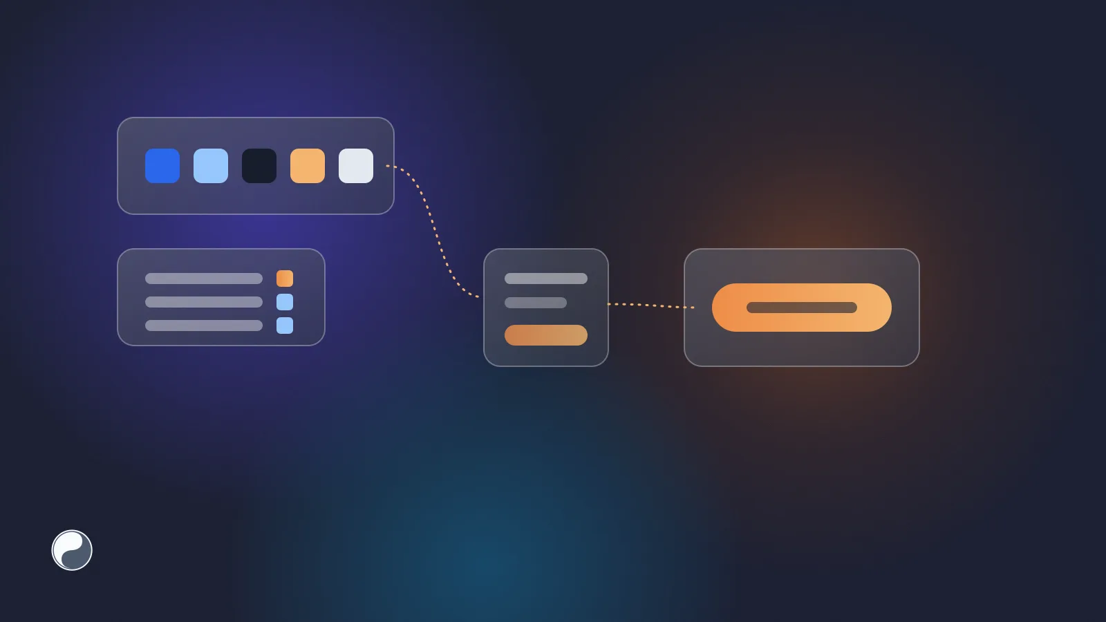
- Use three tiers: primitive tokens hold raw values, semantic tokens name a purpose and point at primitives, component tokens name a part of one component.
- Components read semantic or component tokens only. Primer and Atlassian write that rule down, and Spectrum's tiers follow the same split.
- A rebrand then adds or changes values in the primitive tier and repoints a handful of semantic references. Component code doesn't change.
- Name by purpose, keep one naming grammar, and treat renames as renames: detect them by stable ID, not by name.
Why flat value names break
A flat token set has one level: every token is a value with a name. The name usually describes the value, because that's the easiest thing to name.
There are two ways out, and both hurt. Either you keep the names and let them lie, or you rename every token and touch every component that uses one. The problem isn't the rebrand. It's that the component was told what colour to use instead of why.
The three tiers
The fix is to split one level into three, each answering a different question.
Primitive tokens: what values exist
Primitives are the palette and the scales: every colour, size and duration the system is allowed to use. They're named by value, because value is their job.
color.blue.500 color.blue.300 color.gray.900 space.4 radius.2GitHub's Primer calls these base tokens: "Base tokens are the lowest level tokens and map directly to a raw value" (Primer token names). Adobe Spectrum calls them global tokens, with names such as blue-800 (Spectrum design data).
Semantic tokens: what a value is for
Semantic tokens name a purpose and point at a primitive (see primitive and semantic tokens):
bg.accent       → color.blue.500
fg.muted        → color.gray.600
stack.gap.md    → space.4
Primer calls them functional tokens and describes them as tokens that "represent global UI patterns", such as bgColor-inset and borderColor-default. Atlassian builds its colour tokens from a foundation, a property and a modifier: color.background.brand.bold, color.text.subtle, color.icon.success (Atlassian design tokens). Spectrum calls them alias tokens: accent-background-color-default points at accent-color-900 in the light theme and accent-color-800 in the dark one.
This is the tier that makes a rebrand and a dark theme possible, because only its references change.
Component tokens: what one component needs
Component tokens name a part of a specific component and point at semantic tokens:
button.primary.bg.hover   → bg.accent.hover
input.border.focus        → border.focus
Primer's examples are button-primary-bgColor-hover and control-danger-borderColor-rest, with the rule that "component/pattern tokens should only be used in component CSS". Spectrum has the same tier, for instance swatch-border-color pointing at gray-1000.
This tier is optional. Add it when one component needs to deviate from the semantic default, or when a component library ships themes of its own. Atlassian and Polaris, for example, publish no component tier.
How the public systems name things
The words differ, the split doesn't. Every one of these systems separates "the values we have" from "what we use them for".
The rule that makes it work
Three tiers only help if components respect them. The systems above write the rule down:
- Primer: base colour tokens "don't respect color modes and should never be used directly in code or design" (Primer color usage).
- Atlassian: "Choose tokens based on meaning where applicable, not specific values."
- Primer again, for the component tier: component tokens are only for that component's CSS.
A component that reads color.blue.500 directly skips the semantic tier. It won't follow a rebrand or a dark theme, and it's a common way design system drift starts. Atlassian, which introduced its tokens as "the all important enabler for dark mode" (Atlassian developer community), also ships lint plugins for ESLint and Stylelint (@atlaskit/eslint-plugin-design-system, @atlaskit/stylelint-design-system).
A naming grammar you can keep
Names stay consistent when every token follows the same order of parts. Nathan Curtis's taxonomy of token names (2020) lists the levels: namespace, object (component group, component, element), base (category, concept, property) and modifier (variant, state, scale, mode). His advice: "Include only the levels needed to sufficiently describe and distinguish purposeful intent."
A practical grammar for most teams:
[property].[role].[emphasis].[state]
bg        .accent.bold      .hover
Colour tokens usually dominate a set, so the examples here leave the color category implied. If your set mixes many categories, add it as a first part, the way Atlassian's color.background.brand.bold does.
A few rules keep it readable:
- One word per idea. If you have
bg, don't also havebackground. Atlassian spells it out; Primer abbreviates. Either works, mixing doesn't. - State last.
bg.accent.hover, nothover.bg.accent, so related tokens sort together. - No values in semantic names.
fg.mutedyes,fg.grayno. - Scales by position, not by pixels.
space.4survives a change of base unit,space.16pxdoesn't.
What a rebrand looks like
Here's the same button before and after a rebrand from blue to green, in a three-tier set with a light and a dark mode (an illustrative example).
 color.blue.500     #2563eb
+color.green.500    #16a34a
+color.green.300    #86efac

-bg.accent          light: {color.blue.500}   dark: {color.blue.300}
+bg.accent          light: {color.green.500}  dark: {color.green.300}

 button.primary.bg  {bg.accent}
Two new primitives, one semantic token with two new mode values, and not a single change in the component tier or in component code. The button reads bg.accent, and bg.accent now means green. In a flat set, the same change is a rename of blue-500 across every file that uses it, or a blue-500 that holds green.
Shopify's move from a flat set to semantic tokens shows the other side. Their old, now archived token package used names such as color-blue-lighter and --color-blue-text (polaris-tokens). The current set names purpose and state: --p-color-bg-surface, --p-color-bg-surface-hover, --p-color-bg-fill-brand.
Moving a flat set to three tiers
You don't need a big-bang rename.
- Freeze the palette. Move today's value-named tokens into the primitive tier as they are. Nothing breaks, because nothing is renamed yet.
- Add semantic tokens for the top uses. Background, text, border and accent are a good first set. Point each one at the primitive that components use today.
- Migrate components one at a time from primitives to semantic tokens. A linter rule that flags primitives in component code keeps the migration from sliding back.
- Mark old names deprecated instead of deleting them. The DTCG format has a
$deprecatedproperty for this, and Primer keeps deprecated names mapped to their replacements for the same reason. - Delete the deprecated names only when the linter shows zero uses of primitives in component code.
The risky step is the rename itself. If your tooling identifies tokens by name, renaming blue-500 to color.blue.500 looks like one token deleted and another added, and every consumer breaks at once. Identify tokens by a stable ID instead. Figma variables have one, and a pipeline that keeps it can show a rename as a rename. We covered that in design tokens from Figma to code.
How FISYCO fits in
We build FISYCO, and it follows the tiers you define in Figma rather than imposing its own. Variables keep the groups of their Figma names as path segments, and aliases stay aliases in the generated CSS and DTCG files, which Style Dictionary reads directly. Every token is tracked by its Figma variable ID, so a rename in Figma arrives in the pull request as a rename.
Connect a Figma file and see the first pull request, with your token names kept in sync.