A dark theme often starts as a copy. Someone duplicates the colour file, renames it dark.css, and edits the values. It works until the next change: a new token lands in one file and not the other, and the dark theme quietly falls behind. Token modes solve this by keeping one set of names and switching only the values.
This note shows how to build dark mode design tokens without duplication: how Figma models modes, what the DTCG format now says about themes, and three ways to ship modes as CSS.
Key takeaways
- A theme is a second set of values for the same names, not a second set of tokens. Components keep reading
color-bg-surfacewhatever the theme.- Only the semantic tier changes between light and dark. Primitives stay one palette, and component code doesn't know which mode is active.
- Figma variable modes and the DTCG Resolver Module model this the same way: one token, one value per context.
- In CSS, ship modes as attribute blocks, as separate files, or with
light-dark(). Each fits a different setup.
One set of names, two sets of values
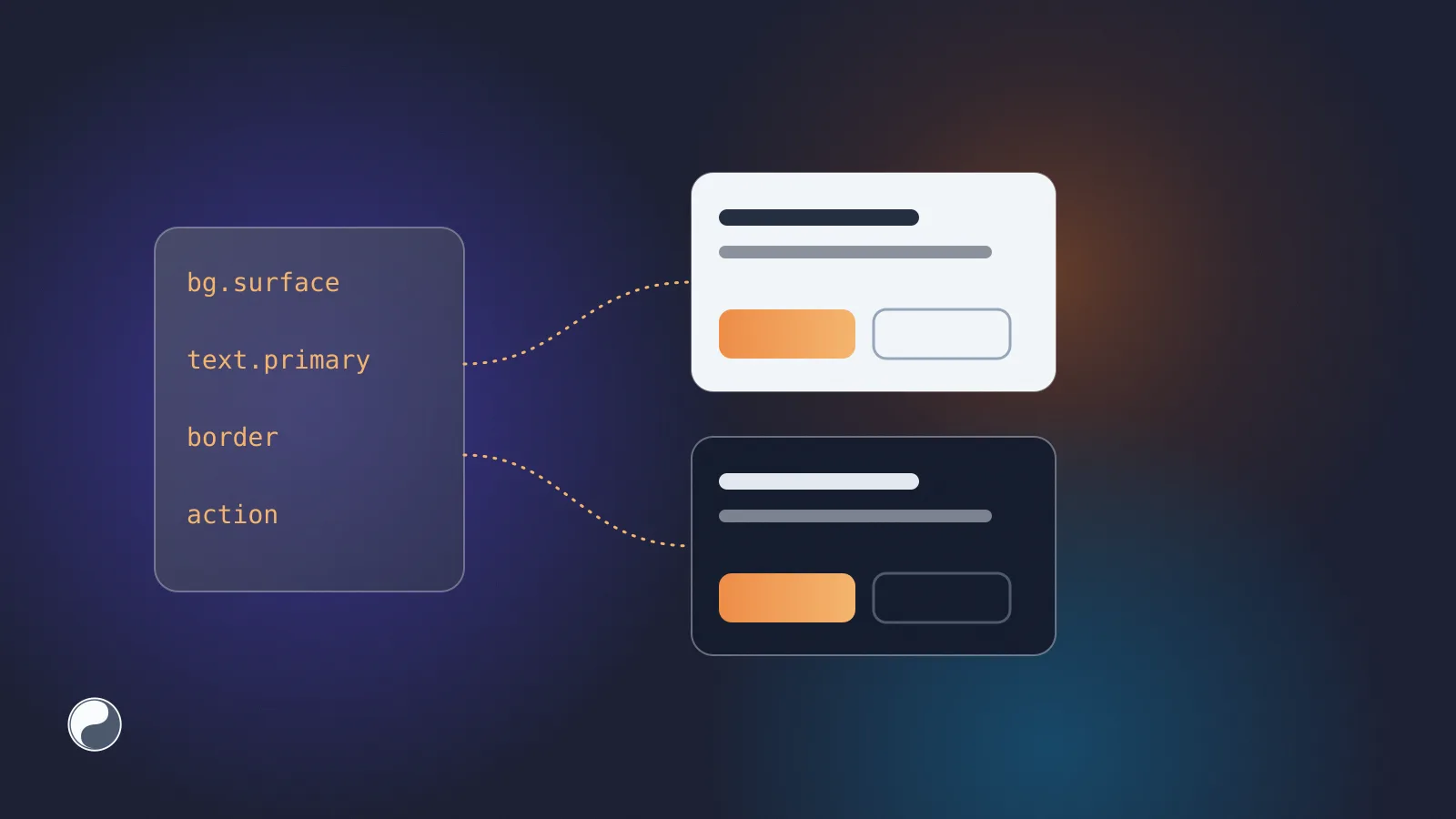
A mode is a context in which the same token resolves to a different value. Light and dark are the usual pair; brands, densities and platforms work the same way. An illustrative semantic set:
The names are identical in both columns. Only the references change, and they point into one shared palette. That's what "without duplication" means in practice: there's no dark-color-bg-surface, and no component that has to choose between two names.
This only works if tokens are split into tiers. Primitives such as gray.900 hold raw values and never change per mode. Semantic tokens such as color-bg-surface name a purpose, and they're the ones that switch. Our guide to naming design tokens explains the tiers in detail.
The large public systems describe the same split. GitHub Primer notes that "by inverting the scales, light and dark themes are able to share many of the same functional color tokens without custom overrides" (Primer). Atlassian puts it more briefly: "Themes are how we switch color schemes and styles everywhere using a single set of tokens" (Atlassian).
Modes in Figma
Figma builds modes into variables. Its help centre says "Variable modes allow us to represent different contexts of our designs without needing to create multiple frames for every context" (Figma).
A collection has one column per mode, and each variable has a value in every column. A frame picks its mode with Apply variable mode. When it's set to Auto, the frame inherits the mode from its parent, or falls back to the collection's default.
Two habits keep Figma modes easy to export:
- Put modes on the semantic collection. Keep primitives in a single-mode collection, and let semantic variables alias them per mode. The export then carries references, not copied hex values.
- Name modes for code. "Light" and "Dark" become file names and selectors later. "Mode 1" typically becomes something like
mode-1, which tells a developer nothing. We learned this from our own exporter: it once named per-mode files by Figma's internal mode ID, which looks like1:0. That gave files such astokens.1:0.css, and a colon isn't a valid file name character on Windows. Files are now named after the mode.
Modes in the DTCG format
The DTCG format reached its 2025.10 release, and themes live in a separate Resolver Module published the same day. A resolver document lists sets of token files and modifiers. A modifier provides "conditional inclusion via the contexts map", and resolutionOrder says which sets and modifiers apply in which order (DTCG Resolver Module).
A theme modifier looks like this, simplified from the specification's own example:
The files that each context points to hold the same token names with different values. That's the same model as a Figma collection, written down as a standard.
Three ways to ship modes as CSS
Once the values exist, the question is how the browser switches between them. There are three common options.
1. Attribute blocks in one file
Every theme lives in one stylesheet. The default values sit in :root, and each mode overrides them under an attribute selector:
Switching the theme means setting data-theme="dark" on <html> or on any subtree. That makes it the most flexible option: a dark sidebar inside a light page is one attribute. To follow the operating system, set the attribute from prefers-color-scheme in a small script, or duplicate the block inside that media query.
2. One file per mode
Each mode gets its own stylesheet, such as tokens.light.css and tokens.dark.css. You load one and swap it, or load both behind media queries:
This suits apps with many modes, such as several brands, where shipping every brand to every user would be wasteful. When the files are generated, they can't drift apart the way a hand-copied dark.css does.
3. light-dark()
The newest option keeps both values in one declaration. MDN says light-dark() "accepts two colors or two images and returns a color or an image based on the active color scheme, without needing a prefers-color-scheme media feature". It needs color-scheme: light dark on the element or root. It's been Baseline for colours since May 2024; image arguments are newer, so check support before relying on them (MDN).
It's compact, and the browser handles the switch. It only covers two schemes, though, and only colours and images. For brands or density modes you still need one of the first two options.
Keeping modes from drifting
Generated modes can't fall out of step by copy and paste, but they can still diverge from the design.
- Check completeness. Every semantic token needs a value in every mode. With attribute blocks, a missing dark value falls back to the
:rootvalue and shows up as a bright panel at night. - Keep literals out of modes. A mode value should reference a primitive. A hex value typed into the dark column bypasses the palette, just like a hex value in a component.
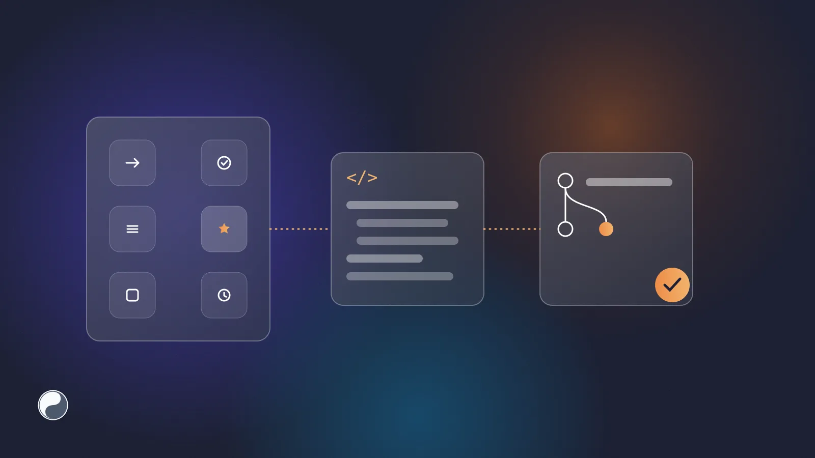
- Ship mode changes as pull requests. Match variables by their Figma IDs, not their names, so a rename shows up as a rename rather than a deletion plus an addition. When a mode value changes in Figma, the code should get the same change in a pull request, not at the next manual export. Our note on Style Dictionary in practice covers the build side.
Where FISYCO fits
We build FISYCO to deliver modes from Figma variables as code. A tokens library exports each mode in the format you choose. With inline modes, tokens.css has the default values in :root and one [data-theme="…"] block per mode, named after the Figma mode. With separate files, each mode gets its own tokens.<mode>.css, and tokens.<mode>.scss if you export SCSS. The DTCG export writes one design-tokens.<mode>.tokens.json per mode; it doesn't write a resolver document yet.
Aliases stay aliases, so a dark value that points to gray.900 arrives as var(--…), not as a copied hex value. Changes come as a pull request when you publish the library in Figma, or on demand.